# A tibble: 10 × 4
   country       year series                                hiv
   <chr>        <int> <chr>                               <dbl>
 1 South Africa  2022 Adults (ages 15+) living with HIV 7400000
 2 India         2022 Adults (ages 15+) living with HIV 2400000
 3 Mozambique    2022 Adults (ages 15+) living with HIV 2300000
 4 Tanzania      2022 Adults (ages 15+) living with HIV 1600000
 5 Uganda        2022 Adults (ages 15+) living with HIV 1400000
 6 Kenya         2022 Adults (ages 15+) living with HIV 1300000
 7 Zambia        2022 Adults (ages 15+) living with HIV 1300000
 8 Zimbabwe      2022 Adults (ages 15+) living with HIV 1200000
 9 Malawi        2022 Adults (ages 15+) living with HIV  950000
10 Ethiopia      2022 Adults (ages 15+) living with HIV  570000
Data Visualization
# List of Top 10 countries with number of adults living with HIV in 2022adult_list <-c("South Africa", "India", "Mozambique", "Tanzania", "Uganda", "Kenya", "Zambia", "Zimbabwe", "Malawi", "Ethiopia")
# specify ten colorscolors <-c("South Africa"="#67000d","India"="#a50f15", "Mozambique"="#cb181d","Tanzania"="#ef3b2c","Uganda"="#fb6a4a", "Kenya"="#fcbba1","Zambia"="#fc9272","Zimbabwe"="#fee0d2","Malawi"="#fde0dd","Ethiopia"="#fff5f0")p1 <- df_adult|>filter(year ==2022) |>filter(country %in% adult_list) |># Match the countries in adult_listggplot(aes(x =reorder(country, hiv), y = hiv, fill = country)) +geom_col() +scale_fill_manual(values = colors) +# Apply custom colorscoord_flip() +scale_y_continuous(labels =comma_format()) +# Use commas to separate numberslabs(title ="Top 10 Countries with Highest Number of Adults Living with HIV In 2022",x ="Country",y ="Number of Adults Living with HIV",fill ="Country",caption ="Source: World Bank | Author: Cindy Xie") +theme_bw() +theme(plot.title =element_text(hjust =0.5, size =16, face ="bold"), axis.title.x =element_text(size =12),axis.title.y =element_text(size =12))ggplotly(p1)
library(htmlwidgets)# convert to interactive plotp1 <-ggplotly(p1)# save the interactive plotsaveWidget(p1, file ="out/p1.html")
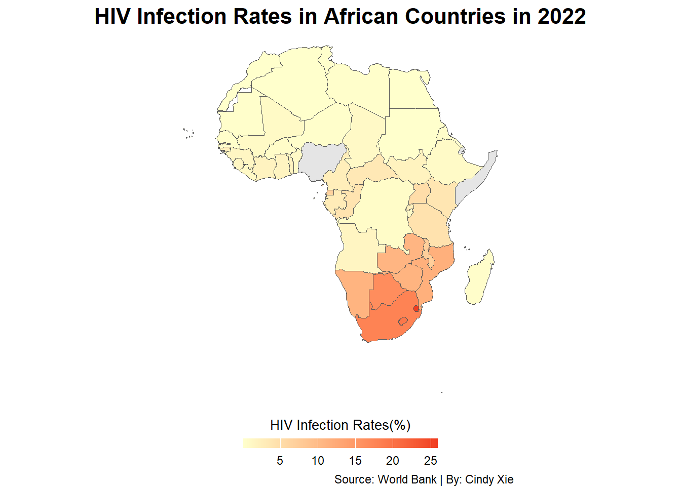
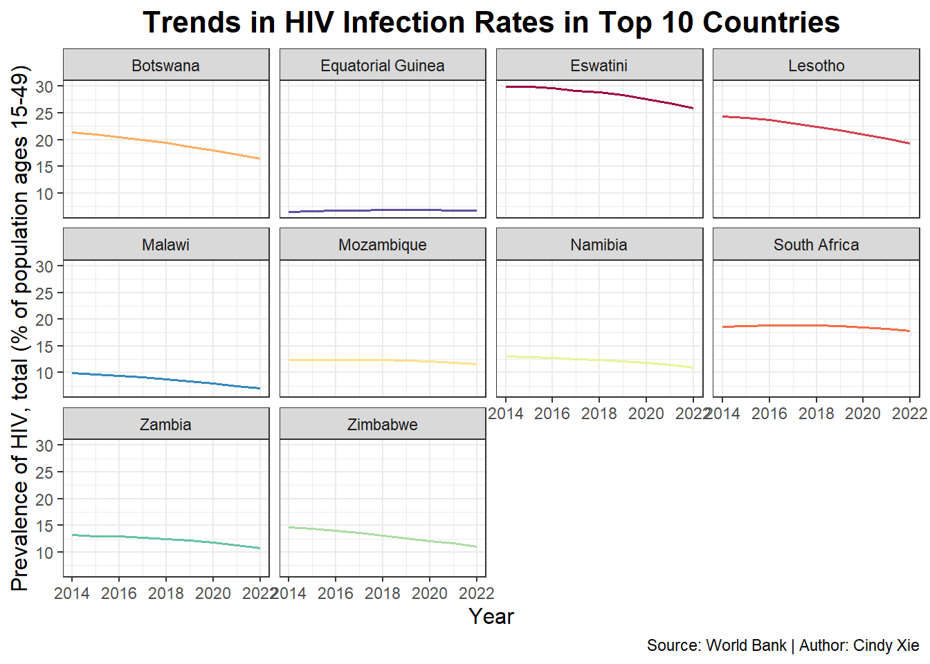
Q2: Top 10 Countries with Highest HIV Infection Rates In 2022 and Trends in the Past Decade
# Select relevant indicatordf_infect <- df_hiv |>filter(series =="Prevalence of HIV, total (% of population ages 15-49)") |>select(country, country_code, year, series, hiv)
# A tibble: 10 × 5
   country           country_code  year series                               hiv
   <chr>             <chr>        <int> <chr>                              <dbl>
 1 Eswatini          SWZ           2022 Prevalence of HIV, total (% of po…  25.9
 2 Lesotho           LSO           2022 Prevalence of HIV, total (% of po…  19.3
 3 South Africa      ZAF           2022 Prevalence of HIV, total (% of po…  17.8
 4 Botswana          BWA           2022 Prevalence of HIV, total (% of po…  16.4
 5 Mozambique        MOZ           2022 Prevalence of HIV, total (% of po…  11.6
 6 Namibia           NAM           2022 Prevalence of HIV, total (% of po…  11
 7 Zimbabwe          ZWE           2022 Prevalence of HIV, total (% of po…  11
 8 Zambia            ZMB           2022 Prevalence of HIV, total (% of po…  10.8
 9 Malawi            MWI           2022 Prevalence of HIV, total (% of po…   7.1
10 Equatorial Guinea GNQ           2022 Prevalence of HIV, total (% of po…   6.7
Data Visualization
# Get global country dataworld <-ne_countries(scale ="medium", returnclass ="sf")# Extract African countries (filtered by the continent)africa <- world |>filter(continent =="Africa") |>select(iso_a3, geometry)
# Merge HIV infection rates data with Africa map datadf_merge <- africa |>left_join(df_infect, by =c("iso_a3"="country_code"))
# Map of HIV infection rates in African countries in 2022p2 <- df_merge |>filter(year ==2022) |>ggplot(aes()) +geom_sf(aes(geometry = geometry, fill = hiv)) +scale_fill_gradient(low ="#ffffcc", high ="#f03b20",na.value ="grey90", name ="HIV Infection Rates(%)", guide =guide_colorbar(barwidth =10,barheight =0.5,title.position ="top",title.hjust =0.5 )) +labs(title ="HIV Infection Rates in African Countries in 2022",caption ="Source: World Bank | By: Cindy Xie") +theme_void() +theme(legend.position ="bottom",legend.title =element_text(size =10),plot.title =element_text(hjust =0.5, size =16, face ="bold"))# save the plot as a fileggsave("out/p2.png", p2, width =11, height =6, dpi =300)p2
# List of Top 10 countries with highest HIV infection rates in 2022infect_list <-c("Eswatini", "Lesotho", "South Africa", "Botswana", "Mozambique", "Namibia", "Zimbabwe", "Zambia", "Malawi", "Equatorial Guinea")
## specify ten colorscolors <-c("Eswatini"="#9e0142","Lesotho"="#d53e4f", "South Africa"="#f46d43","Botswana"="#fdae61","Mozambique"="#fee08b","Namibia"="#e6f598","Zimbabwe"="#abdda4","Zambia"="#66c2a5","Malawi"="#3288bd","Equatorial Guinea"="#5e4fa2")p3 <- df_infect |>filter(country %in% infect_list) |># Match the countries in infect_listggplot(aes(x = year, y = hiv, color = country)) +geom_line(linewidth =0.7) +# Adjust line thicknessscale_color_manual(values = colors) +# Apply custom colorslabs(title ="Trends in HIV Infection Rates in Top 10 Countries",x ="Year",y ="Prevalence of HIV, total (% of population ages 15-49)",caption ="Source: World Bank | Author: Cindy Xie") +theme_bw() +facet_wrap(~country) +theme(legend.position ="none") +theme(plot.title =element_text(hjust =0.5, size =16, face ="bold"), axis.title.x =element_text(size =12),axis.title.y =element_text(size =12))# save the plot as a fileggsave("out/p3.png", p3, width =11, height =6, dpi =300)p3
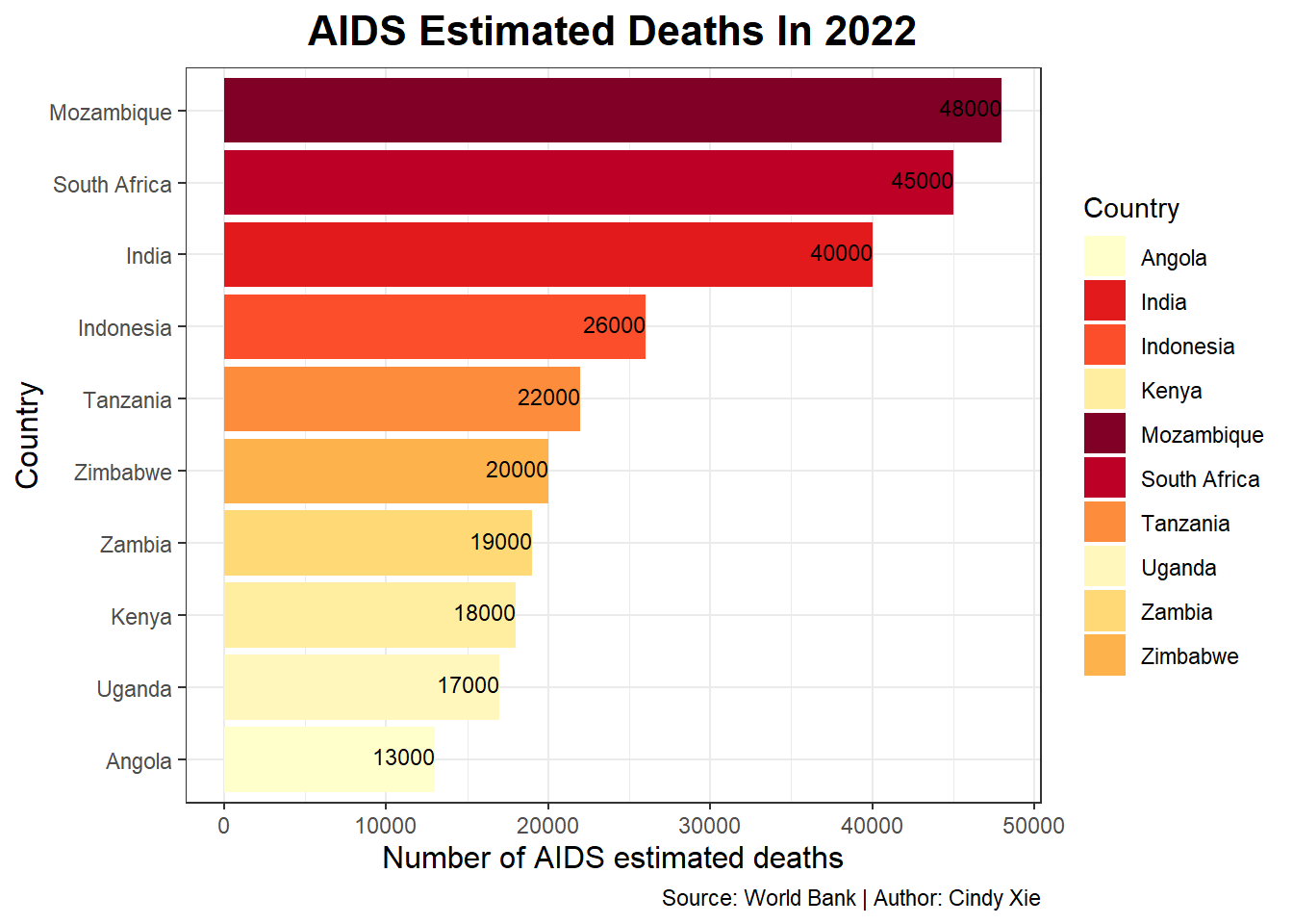
Q3: Top 10 Countries with Highest Number of AIDS Deaths In 2022
# A tibble: 10 × 4
   country       year series                                     hiv
   <chr>        <int> <chr>                                    <dbl>
 1 Mozambique    2022 AIDS estimated deaths (UNAIDS estimates) 48000
 2 South Africa  2022 AIDS estimated deaths (UNAIDS estimates) 45000
 3 India         2022 AIDS estimated deaths (UNAIDS estimates) 40000
 4 Indonesia     2022 AIDS estimated deaths (UNAIDS estimates) 26000
 5 Tanzania      2022 AIDS estimated deaths (UNAIDS estimates) 22000
 6 Zimbabwe      2022 AIDS estimated deaths (UNAIDS estimates) 20000
 7 Zambia        2022 AIDS estimated deaths (UNAIDS estimates) 19000
 8 Kenya         2022 AIDS estimated deaths (UNAIDS estimates) 18000
 9 Uganda        2022 AIDS estimated deaths (UNAIDS estimates) 17000
10 Angola        2022 AIDS estimated deaths (UNAIDS estimates) 13000
Data Visualization
# List of Top 10 countries with highest number of AIDS estimated deaths in 2022death_list <-c("Mozambique", "South Africa", "India", "Indonesia", "Tanzania", "Zimbabwe", "Zambia", "Kenya", "Uganda", "Angola")
# specify ten colorscolors <-c("Mozambique"="#800026","South Africa"="#bd0026", "India"="#e31a1c","Indonesia"="#fc4e2a","Tanzania"="#fd8d3c","Zimbabwe"="#feb24c","Zambia"="#fed976","Kenya"="#ffeda0","Uganda"="#fff7bc","Angola"="#ffffcc")p4 <- df_death|>filter(year ==2022) |>filter(country %in% death_list) |># Match the countries in death_listggplot(aes(x =reorder(country, hiv), y = hiv, fill = country)) +geom_col() +scale_fill_manual(values = colors) +# Apply custom colorscoord_flip() +labs(title ="AIDS Estimated Deaths In 2022",x ="Country",y ="Number of AIDS estimated deaths",fill ="Country",caption ="Source: World Bank | Author: Cindy Xie") +geom_text(aes(label =round(hiv)), vjust =0.3, hjust =1, size =3) +# Add text labels to charts and adjust their sizetheme_bw() +theme(plot.title =element_text(hjust =0.5, size =16, face ="bold"), axis.title.x =element_text(size =12),axis.title.y =element_text(size =12))# save the plot as a fileggsave("out/p4.png", p4, width =11, height =6, dpi =300)p4
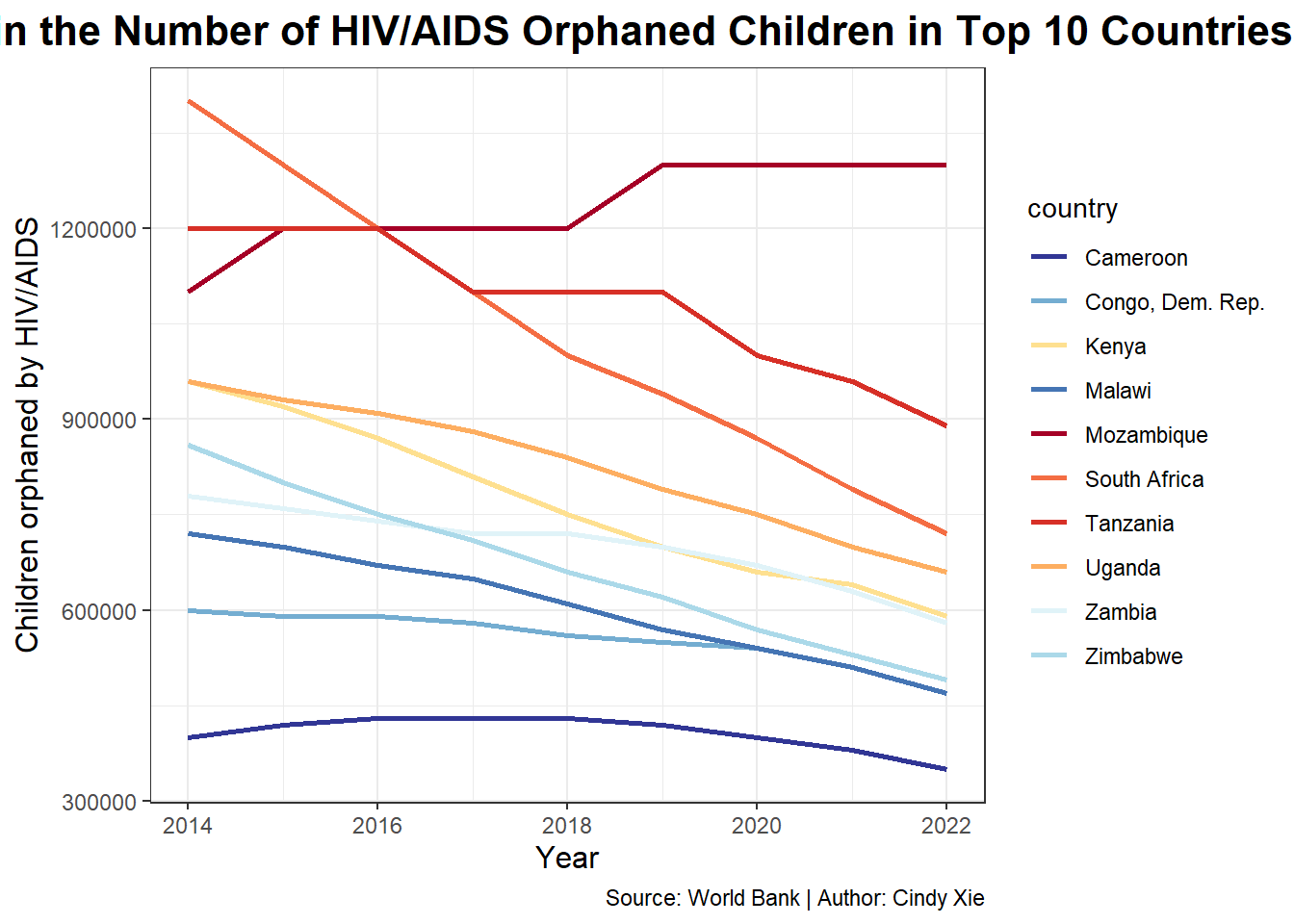
Q4: Top 10 Countries with Highest Number of HIV/AIDS Orphans In 2022 and Trends in the past decade
# A tibble: 10 × 4
   country           year series                            hiv
   <chr>            <int> <chr>                           <dbl>
 1 Mozambique        2022 Children orphaned by HIV/AIDS 1300000
 2 Tanzania          2022 Children orphaned by HIV/AIDS  890000
 3 South Africa      2022 Children orphaned by HIV/AIDS  720000
 4 Uganda            2022 Children orphaned by HIV/AIDS  660000
 5 Kenya             2022 Children orphaned by HIV/AIDS  590000
 6 Zambia            2022 Children orphaned by HIV/AIDS  580000
 7 Zimbabwe          2022 Children orphaned by HIV/AIDS  490000
 8 Congo, Dem. Rep.  2022 Children orphaned by HIV/AIDS  470000
 9 Malawi            2022 Children orphaned by HIV/AIDS  470000
10 Cameroon          2022 Children orphaned by HIV/AIDS  350000
Data Visualization
# List of Top 10 countries with highest number of HIV/AIDS orphans in 2022orphan_list <-c("Mozambique", "Tanzania", "South Africa", "Uganda", "Kenya", "Zambia", "Zimbabwe", "Congo, Dem. Rep.", "Malawi", "Cameroon")
# specify ten colorscolors <-c("Mozambique"="#a50026","Tanzania"="#d73027", "South Africa"="#f46d43","Uganda"="#fdae61","Kenya"="#fee090","Zambia"="#e0f3f8","Zimbabwe"="#abd9e9","Congo, Dem. Rep."="#74add1","Malawi"="#4575b4","Cameroon"="#313695")p5 <- df_orphan |>filter(country %in% orphan_list) |># Match the countries in orphan_listggplot(aes(x = year, y = hiv, color = country)) +geom_line(linewidth =0.9) +# Adjust line thicknessscale_color_manual(values = colors) +# Apply custom colorslabs(title ="Trends in the Number of HIV/AIDS Orphaned Children in Top 10 Countries",x ="Year",y ="Children orphaned by HIV/AIDS",caption ="Source: World Bank | Author: Cindy Xie") +theme_bw() +theme(plot.title =element_text(hjust =0.5, size =16, face ="bold"), axis.title.x =element_text(size =12),axis.title.y =element_text(size =12))# save the plot as a fileggsave("out/p5.png", p5, width =11, height =6, dpi =300)p5